

Drizly - Alcohol Delivery App
August 2018
Client Project
Duration - 3 Weeks
What is Drizly?
Drizly is the world's largest alcohol marketplace and delivery service that connects the customer to the liquor store. Drizly promises the best prices compared from the nearest stores in your location as well as delivery to your personal residence or business in under 1 hour.
How Drizly Works
Drizly works with local stores so you can shop their shelves using your smartphone or computer to order beer, wine and liquor at the touch of a button. You still have to drink it the old fashioned way, though.

Image from Drizly.com
Overview
Currently on Drizly's website and mobile app there is a large amount of reference information regarding recipes and their accompanying products for sale, but no great way to get users to convert from those pages back to the marketplace to purchase. The challenge was to design a solution that convert more users that visit those pages into on-demand delivery customers. The team and I dove deeper to not only to create sales conversions on the website, but to also engage users to convert over to using the mobile app for a more personalized experience and to increase customer retention.
My Role
Working in a team of four Designers, I contributed to the full process of the project from Discovery to Prototyping and Testing.
Methodologies
Research
Data Synthesis and Analysis
Ideation
Paper Prototyping
Wireframing
UI Design
User Testing
Digital Prototyping
Tools
Pen and Paper
Whiteboard
Post-it Notes
Trello (Time Management & Organization)
Slack (Communication)
Sketch
Invision
Google Docs
Google Slides (Presentation)
The Problem
Currently on Drizly's website and mobile app there is a large amount of reference information regarding recipes and their accompanying products for sale, but no great way to get users to convert from those pages back to the marketplace to purchase.
The Solution
We believe that designing and implementing a recipes section for the Drizly website and mobile app will help convert more users that visit those pages into on-demand delivery customers. Using the power of SEO for discoverability we will be able to also convert mobile web users to mobile app, creating a more personalized experience and increase customer retention rates.
Research & Discovery
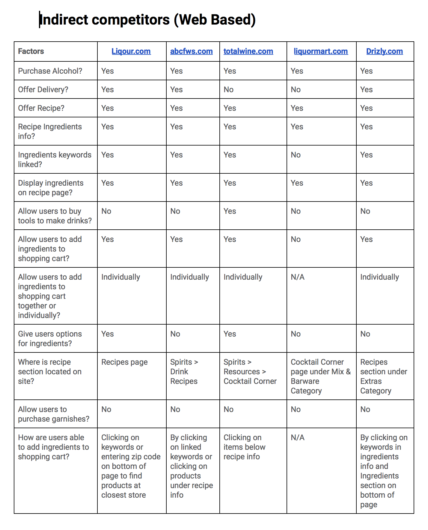
Who else is doing it? (Competitive Analysis)
To get a better understanding of Drizly's competitors, we scoped out 3 potential mobile apps that seemed to be the closest competition to Drizly in the market. We were mainly trying to focus on recipes and were trying to figure out how others were utilizing recipes in their apps. Unfortunately when analyzing these apps, none seemed to offer any information on recipes at all.


Strengths
Location of nearest stores
Compare prices
Inventory based on location/store
Weaknesses
No recipes
Limited store to shop from
Lack of personalization
What about the recipes?
Due to the non existence of recipes on the competitors mobile apps, we wanted to dig deeper and find others who did offer recipe information. Most of our findings were more web based than mobile but still gave us some interesting insights on how we might structure our recipe pages and tie them in to our online store.
Surveys and User Interviews
Now with a better understanding of the business side of this emerging market, it was time to get some insights from some potential users. We wanted to better understand why people search for recipes, where they go to find them as well as their preference in alcohol an so on. A screener survey was sent out to find participants for interviews.
We conducted over 12 user interviews with selected respondents and gathered some interesting insights that would help us understand the behaviors of people when it came to searching recipes and what they love to drink.


What people said...
"I like trying new things, I like following recipes because sometimes it’s a challenge"
"I usually Google recipes"
"I usually make drinks for special occasions like birthday parties or Christmas"
Synthesizing The Data (Affinity Mapping)
After concluding our initial user interviews, we were left with an abundance of data and some really interesting insights. We began to synthesize our data using an Affinity Map.

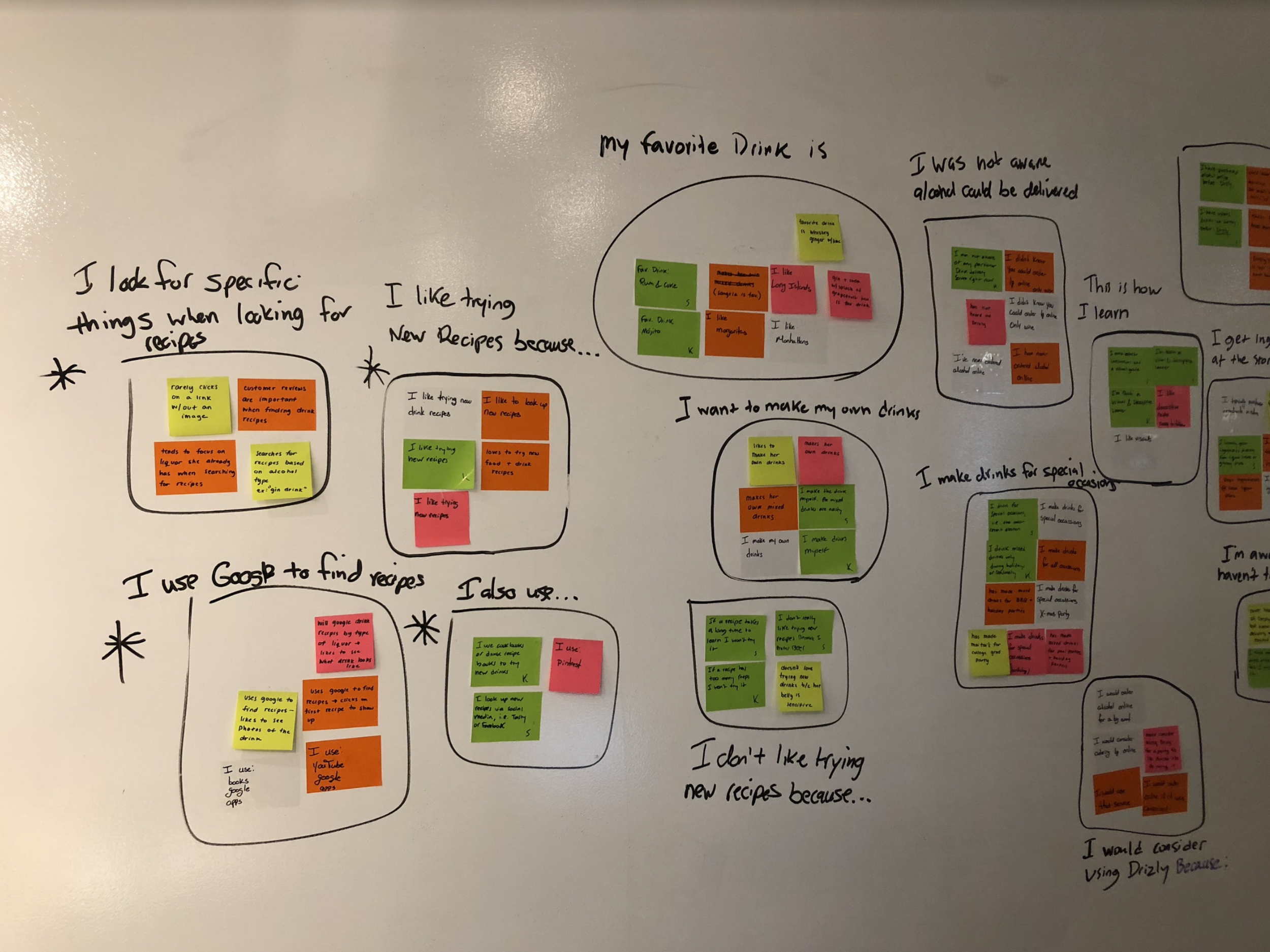
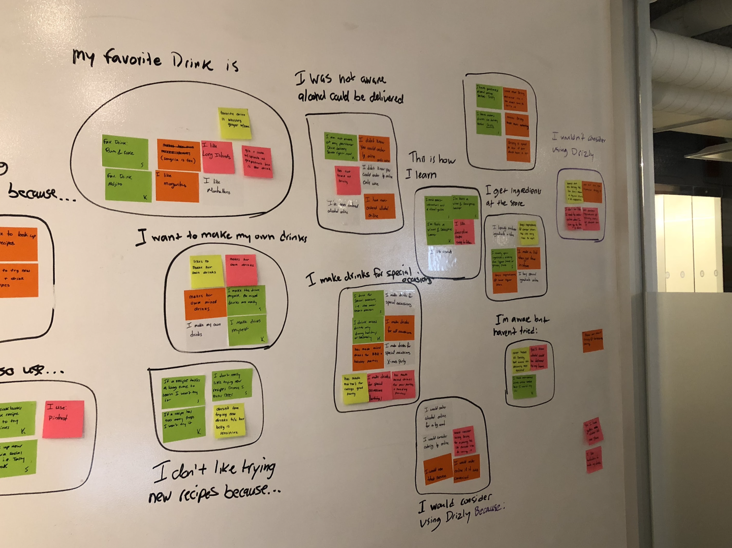
Key Takeaways
Most people make drinks for special occasions
Most people are visual learners
Majority of the people use Google to search for recipes
Everyone has a favorite drink / different drink preferences
Ideation & Sketching
1st Iteration - Whiteboarding sessions
We started off our ideation phase by taking what we've learned from our research so far into consideration and brainstorming ideas on possible solutions. We started designing screens for the Drizly mobile app since it was a blank palette considering there were no recipes being offered on the current mobile app. We focused on creating a personalized experience for users not only when they engage with the recipes page, but from the initial sign up. We wanted the experience for users to be even more tailored each time they used the app.
This consisted of creating a simple onboarding asking users for their favorite type of drinks or alcohol. Not only would this allow us to personalized the app for the user but it would allow Drizly to accumulate vital data from their users.


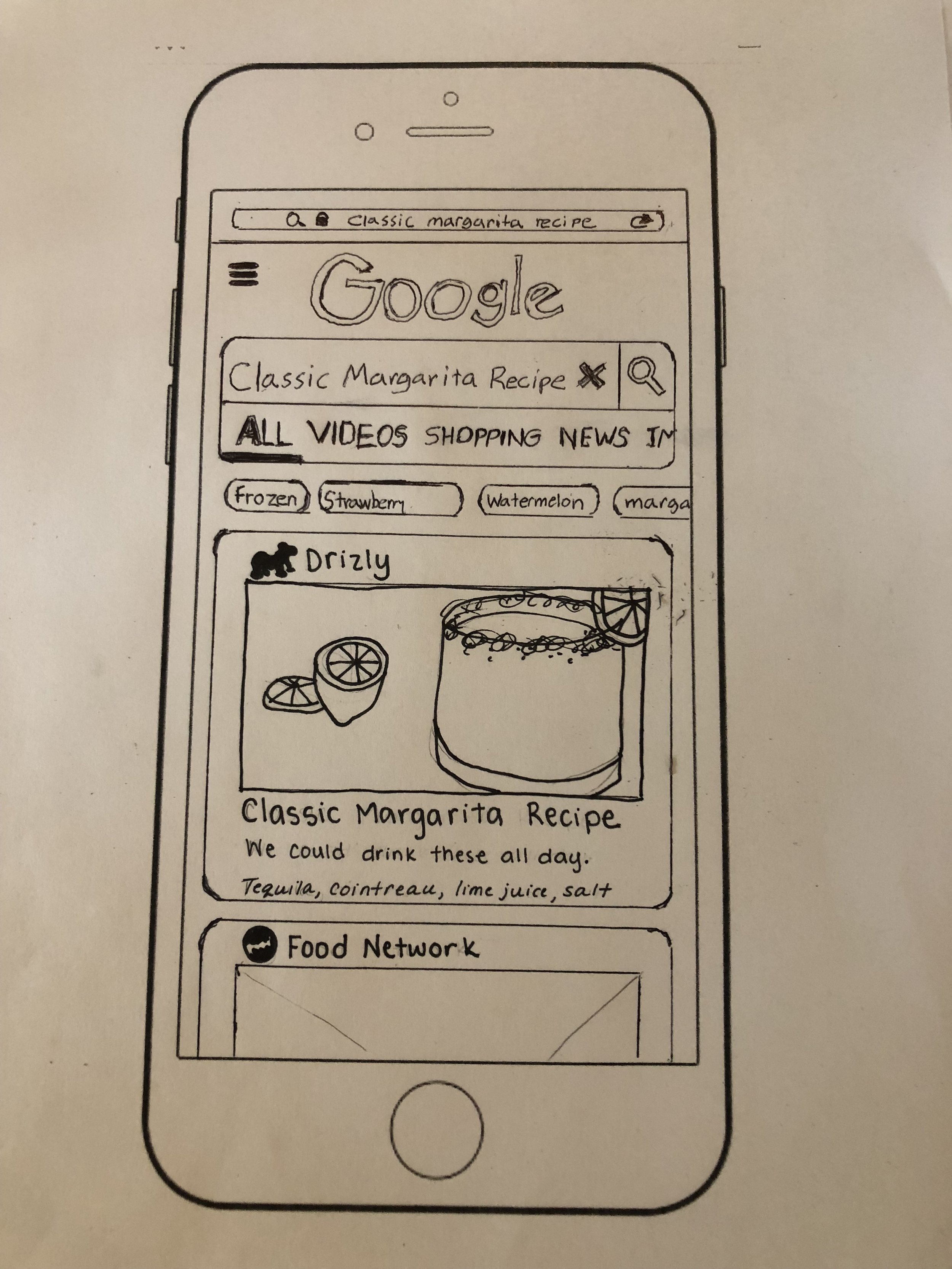
A/B Testing Smart Banners
Before creating screens for testing, we sat down to brainstorm ideas on how we could get users to convert from mobile web to mobile app. After some research, we discovered maybe the best approach would be to use smart banners and links to download the app in the App Store. We ran across a few different versions of smart banners we could possibly use, so my team an I decided to sketch out each version and do some A/B Testing.


2nd Iteration - Paper Prototyping & Testing
When refining our ideas for possible solutions during our whiteboard sessions, we came to an agreement on a flow and how the UI should be structured. In order to validate and test our solutions quickly we transferred our ideas to paper and created a clean higher fidelity version to test with. We wanted to get users reactions to their experience and the flow from initial search to finding a recipe on the mobile app. We especially wanted to see how users would react to the smart banner and if they would indeed convert to using the app instead of browsing through the mobile web version of Drizly.


User Flow
A user flow was created to show the flow of new user creating an account to searching for a recipe and eventually purchasing ingredients to make their drink.
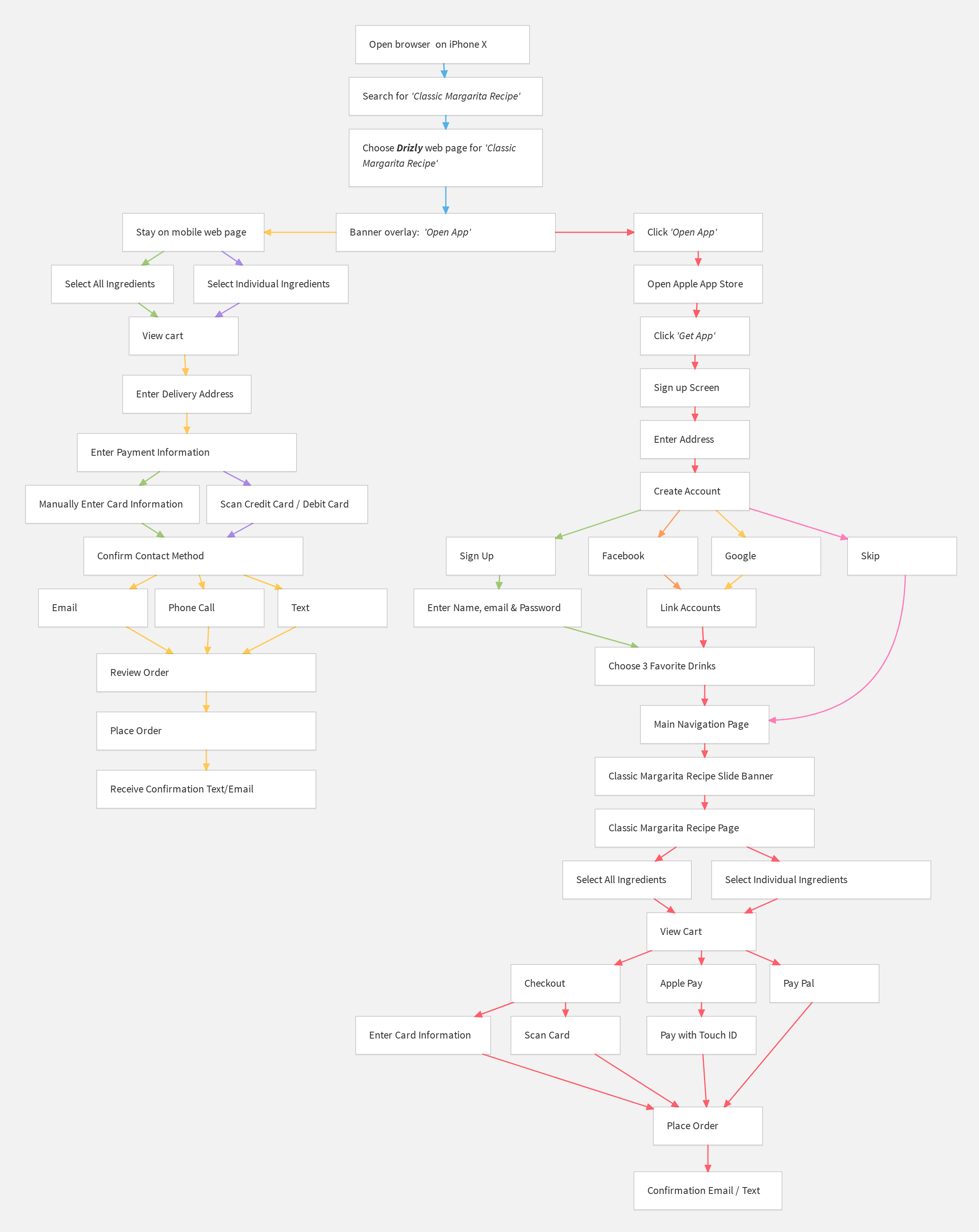
We combined multiple user flows to show the different routes a user may take to accomplish their goal.
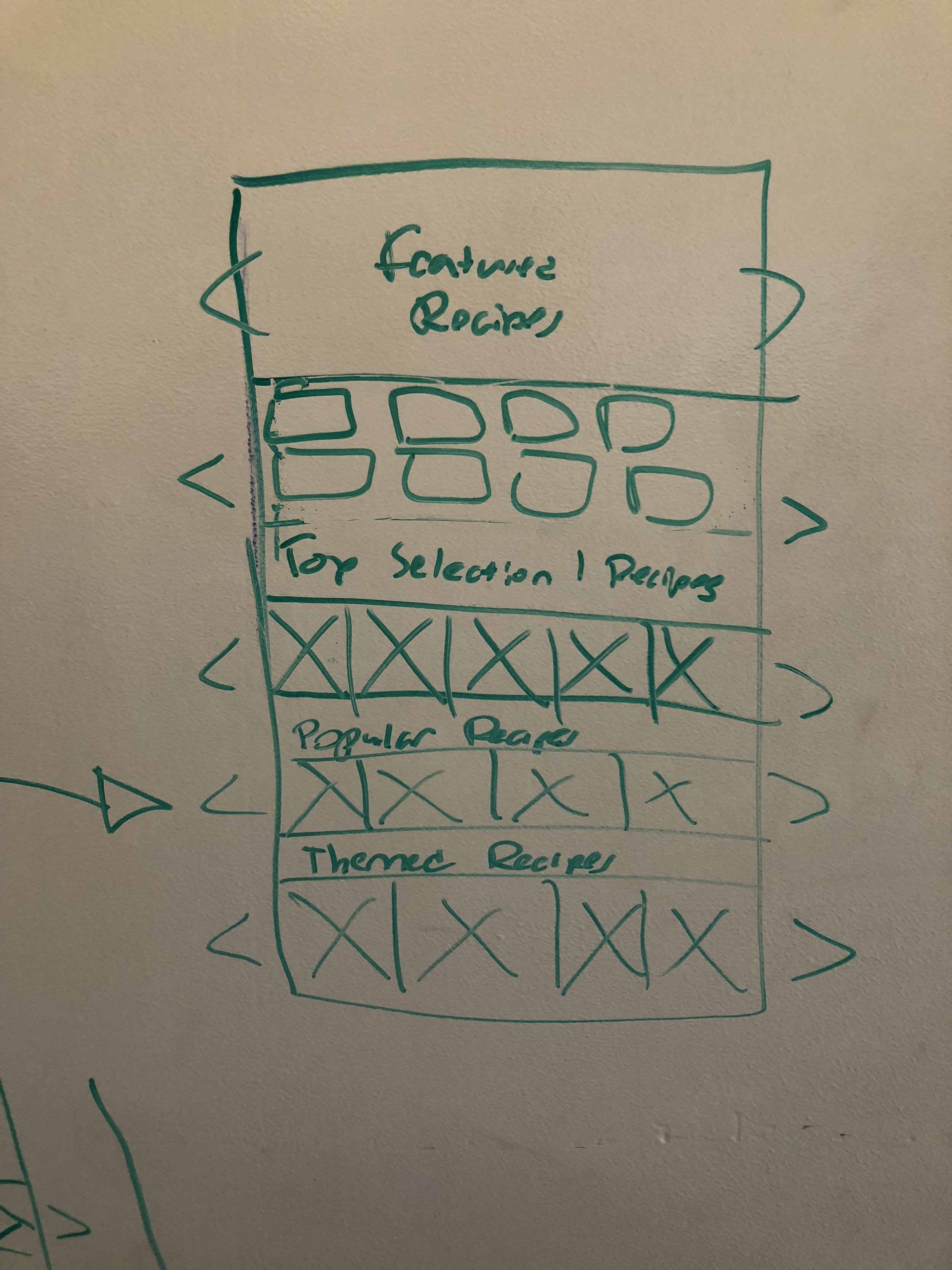
Wireframes

Drizly Onboarding
Onboarding for Drizly app. This will allows Drizly to tailor the experience of the user as well as gather some useful data from their users.

Drizly App Home Page
The design for the home page of Drizly mobile app includes adding Recipes to the main menu and lists of products tailored to the user according to what they chose at onboarding.
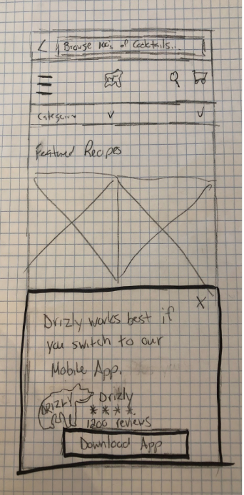
Smart Banner
This is the screen for the mobile web version of the recipes page, which includes the smart banner button to convert users to download and use the mobile app.

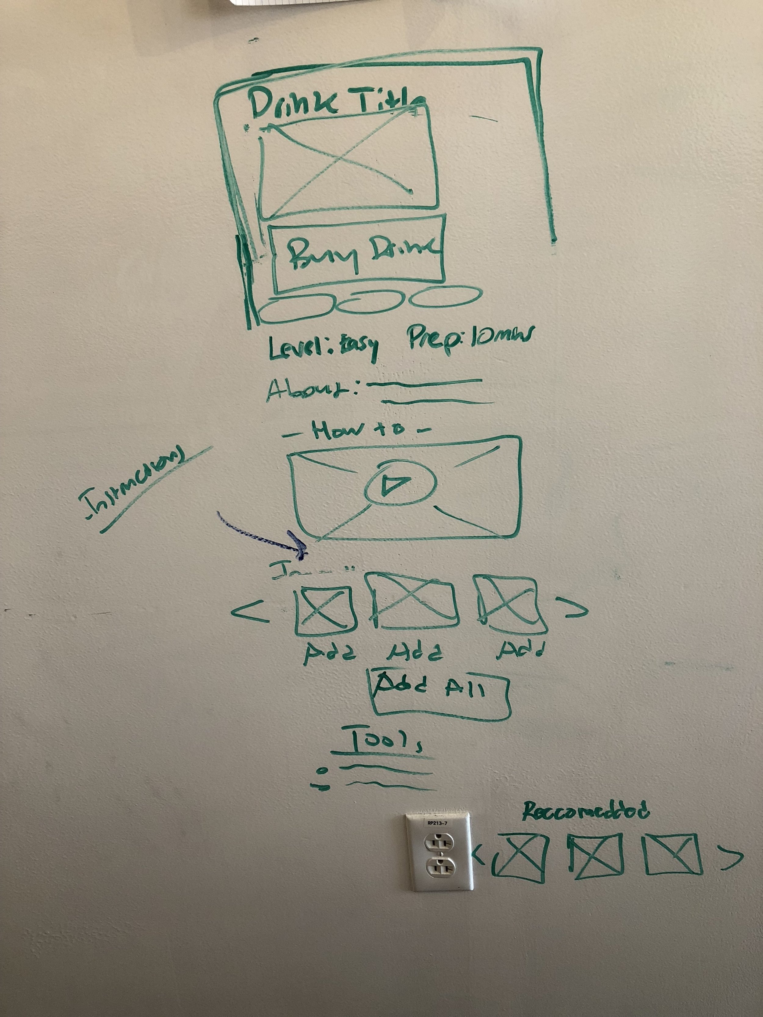
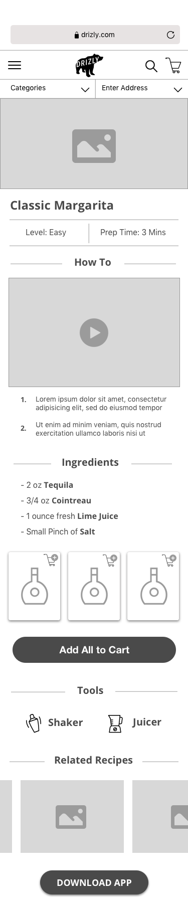
Single Recipe Page
The single recipes page gives the user easy instructions with a video how-to along with the ability to browse ingredients and purchase them directly from the page.
UI Design
Our solution involves a redesign of the recipes pages on the website as well as implementing recipes to the mobile app in which was non existent. Due to time constraints, our design was mainly focused on the mobile app side. In creating the UI for this project we used the style guide provided to us by the client. The client had mentioned to us that Drizly will undergo a brand redesign by sometime next year, with that in mind, we decided to focus this project mainly on the user experience and features that could be incorporated in the next redesign, rather than overhauling the entire UI.


Style Guide

Prototype

Future Considerations
This project was a true learning experience for my team and I. From learning the business side of Drizly to discovering the behaviors of users when is comes to alcohol, there was so much to take away from completion. Through speaking with our clients on numerous occasions to get feedback and present our work we were able to come up with a solution that we think would not only enhance the experience of Drizly users, but help with the growth of Drizly on the business side, increasing conversions and customer retention, overall creating more awareness of the Drizly app itself.
As any project, our work is never complete. After testing our high fidelity prototype with users and presenting to our client, there were some things that could be improved. In our prototype, we have users directed straight to the recipe page from the app store and downloading the app. We then realized this was not feasible and would have to think of a way to direct users to the recipe they were searching for on web to mobile without a hitch or long process if even possible.
In the end our client was thrilled at the solutions we came up with and mentioned they will be incorporating our ideas into their next redesign coming 2019.